|
|||||||
| PR:BF2 Community Modding Making or wanting help making your own asset? Check in here |
 |
|
|
Thread Tools | Display Modes |
|
|
#2 |
|
Join Date: Dec 2006
Posts: 743
|
Imo MEC's Uniforms are just too brown. I don't think that it's that little bit of green which makes the MECs better visible. I bet you won't recognise the difference between the vanilla MEC iniforms and the gry/brown ones of you on 50 meters.
Edit: just realised that it's not the "brownnes" which makes MECs better visible... it's the darkness. And the green in the Uniform lets the MEC look darker than with the grey. Of course removing or towning down the brown would make the MECs less visible too. But there's one Point you may not forget. If the MEC uniform gets more USMC-like (more yellow/beige and less brown) , it will be harder to differ between US an MEC ---> more TK |
|
|
Last edited by LiquidSnake; 2007-02-06 at 00:32..

|
|
|
#3 |
|
Join Date: Jun 2006
Posts: 143
Location: Queens, NY
|
Look at all the TKs in all those screenshots.
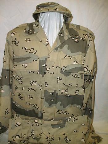
Anyway, isn't the MEC uniform based on a real military camouflage from the region? (Lebanon, I think, uses this pattern) Maybe change it to the camo scheme of Saudi Arabia, which looks like the old US chocolate chip pattern: 
|
|
|

|
|
|
#4 | |
|
Join Date: Feb 2006
Posts: 2,929
Location: US
|
Quote:
Also, can you take a look at the China uniform and maybe do something about the red in it? | |
|
|

|
|
|
#5 | |||
|
Retired PR Developer
|
Quote:
This combined with the lack of green, makes for much better camofluage. Re: Tks, I could have made the uniforms much lighter, so they look like the US does, but that would be bad for that reason, so I didn't go overboard with the lightening. Quote:
Quote:
| |||
|
|
||||
|
|
Last edited by GeZe; 2007-02-06 at 00:45..

|
|
|
#6 |
|
Join Date: Nov 2004
Posts: 1,895
Location: Seattle, Washington
|
please take some comparison shots with graphics set to high on everything, then ill comment. the stuff is too low res for me too like right now.
|
|
|

|
|
|
#7 |
|
Join Date: Nov 2006
Posts: 2,082
|
Can't see anything
|
|
|

|
|
|
#8 |
|
Join Date: Feb 2006
Posts: 2,929
Location: US
|
Check these patterns out
http://www.defendamerica.mil/images/...pi090704a1.jpg http://www.arcent.army.mil/cflcc_today/2004 /august/images/aug/anthemsalute.jpg http://www.defence.gov.au/defencemag...qisoldiers.jpg http://www.thewe.cc/thewei/&/images3...ya_vehicle.jpe This shows how good this pattern blends in against a backdrop http://www.completethemission.org/img/ing2.jpg Here's a not so good one http://www.globalsecurity.org/milita...04-07-14-1.jpg Also, here is a very good one. http://www.thevillager.com/vil_94/iraqsoldier.gif |
|
|

|
|
|
#9 |
|
Retired PR Developer
|
oops, my graphics are on low, sorry, here are better pics:
     
|
|
|
|
|
|

|
|
|
#10 |
|
Join Date: Jul 2006
Posts: 287
Location: Pensacola, FL.
|
What! You mean there is camoflauge in this game? The way the game engine works and the lighting you can spot an enemy a mile away... I honestly dont think camo helps.
|
|
|

|
 |
| Tags |
| combat, desert, mec, uniform, urban |
|
|